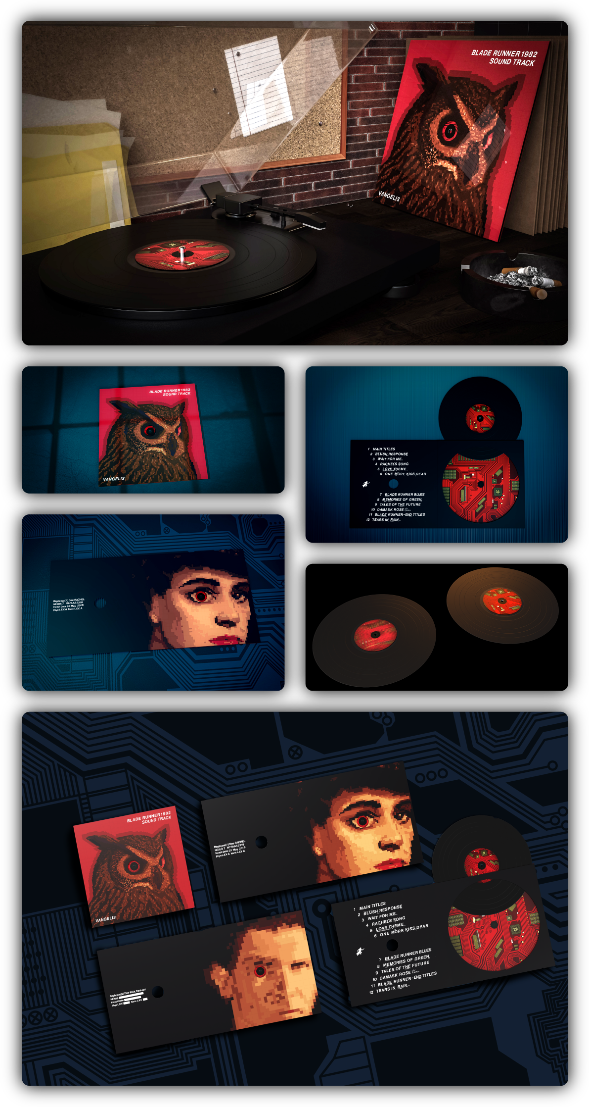
Blade Runner 1982 Soundtrack Vinyl
The Problem
The Blade Runner soundtrack artwork failed to fully reflect the film’s themes and narrative progression clearly.
The Insight
Using 80s-style pixel art and Letraset maintains the film’s original aesthetic while adding a fresh creative approach.
The Solution
Replicants are revealed in narrative order through decreasing pixel clarity and resolution across the vinyl design.
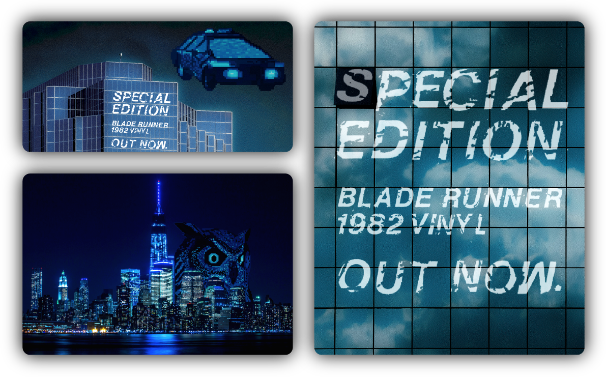
Holographic Ads and Displays
A holographic campaign builds anticipation for the album. A giant owl installation serves as a landmark, while smaller projections of Deckard’s spinner appear across cities. Letraset inspired typography on buildings announces the album title and release date.
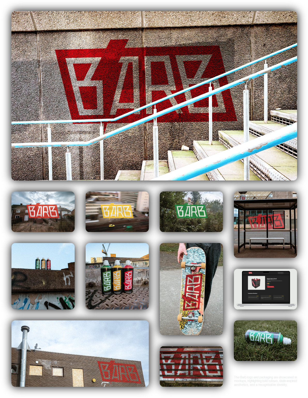
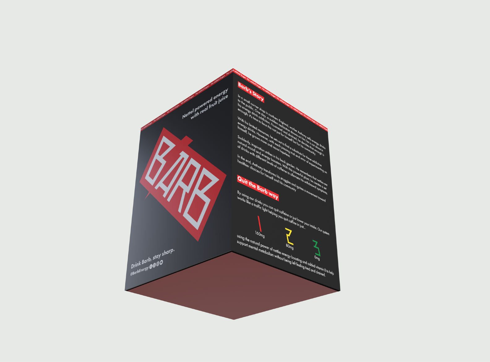
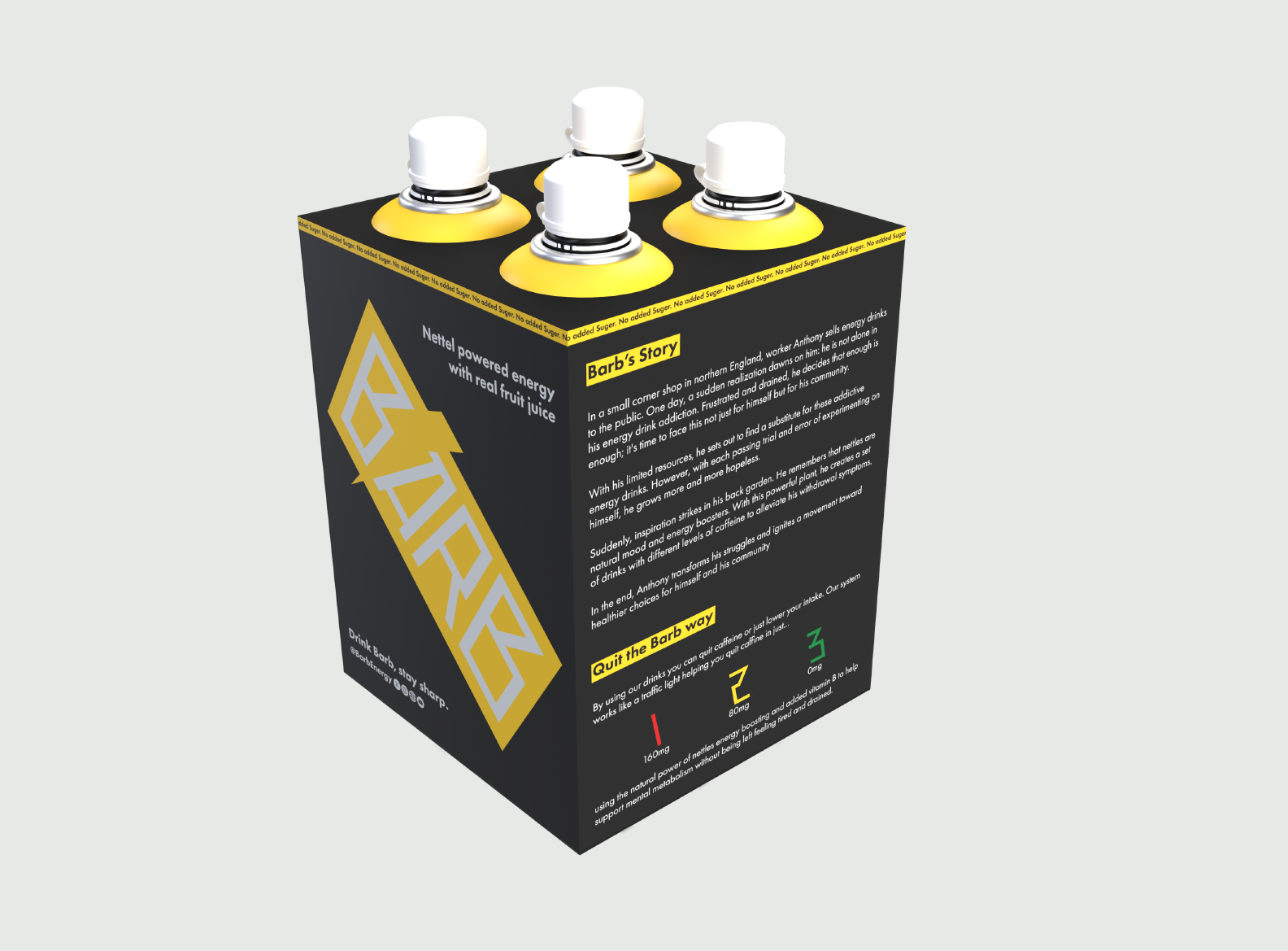
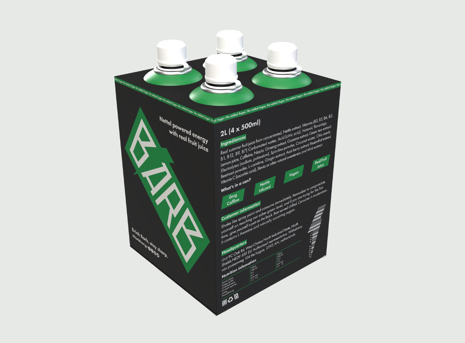
BARB Energy Drink Branding
The Problem
Energy drinks target young adults but often create unhealthy dependency and sudden caffeine spikes over extended periods.
The Insight
A brand using bold colours and skate/graffiti culture can engage and educate users creatively and visually communicate.
The Solution
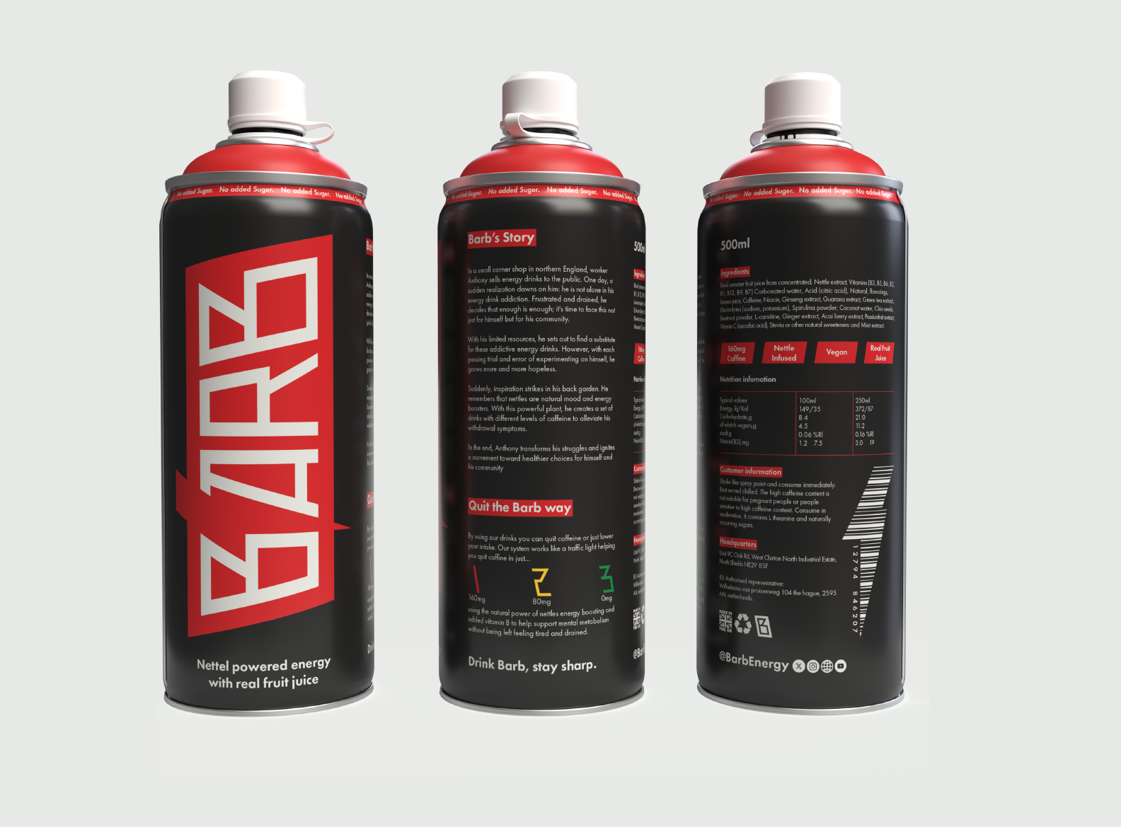
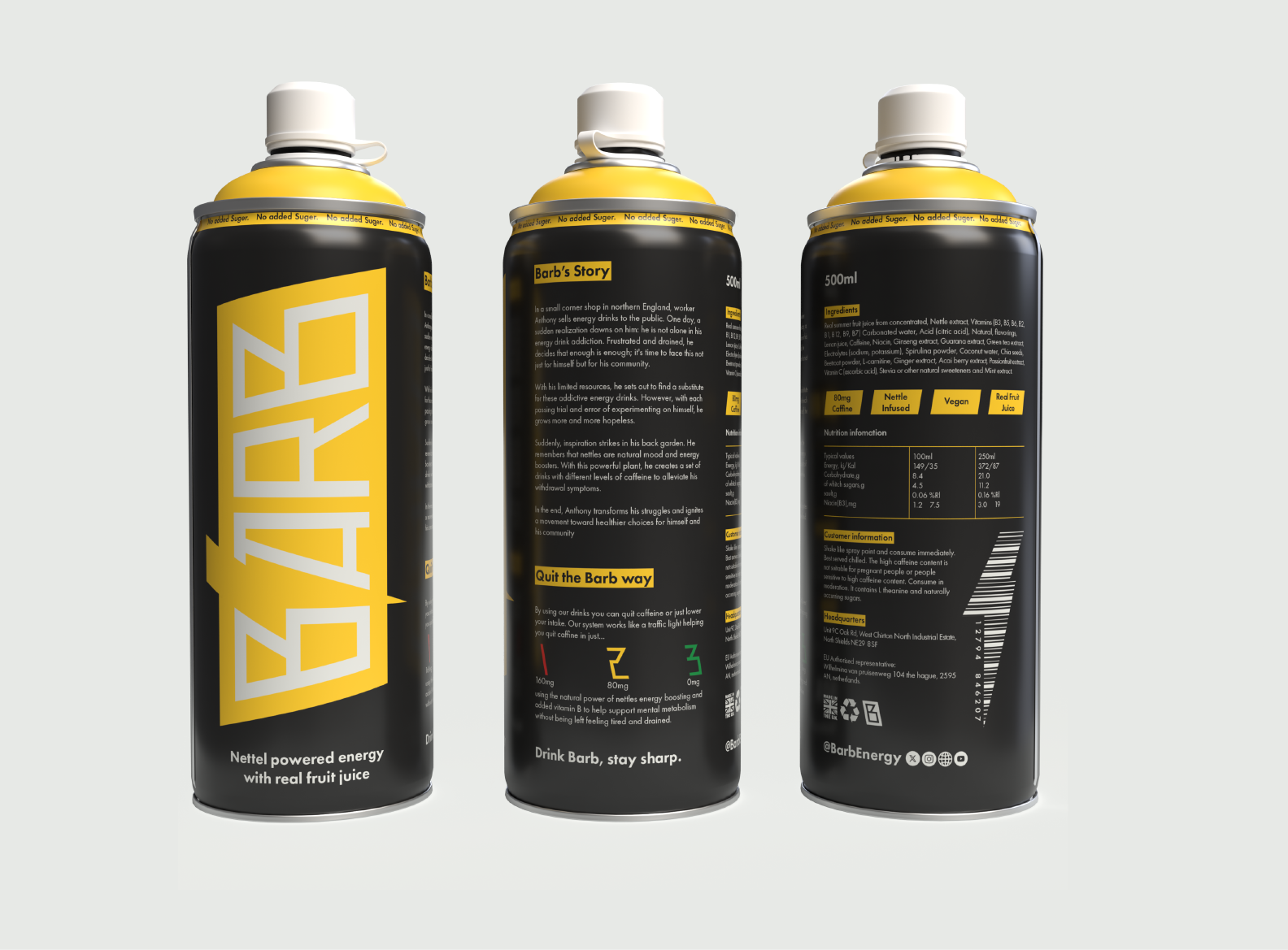
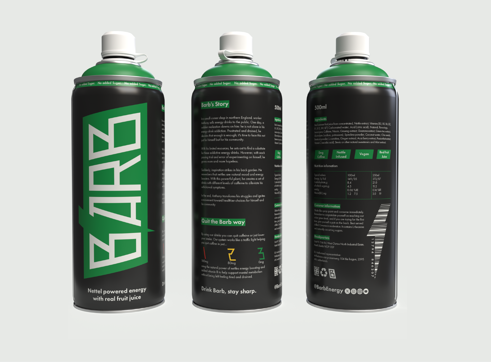
Barb gradually reduces caffeine across three identical flavours, helping users quit without drastic compromise safely and effectively.
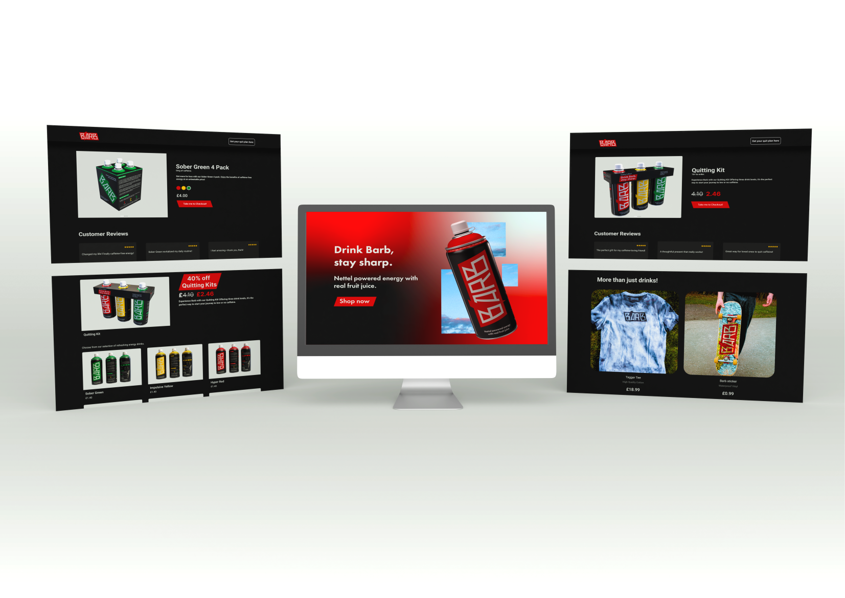
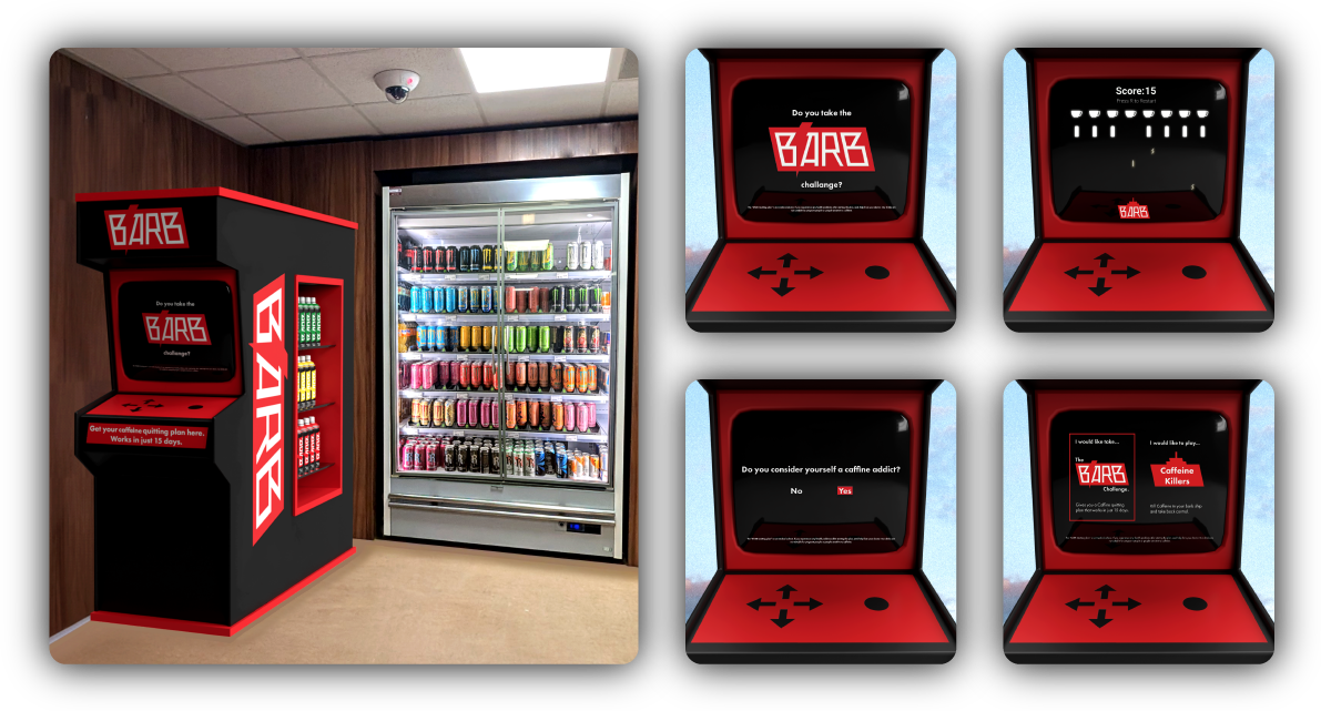
Point of Sale Experience
The arcade-style point of sale features a fridge and a playable “Caffeine Killers” game. Users can take the quitting challenge quiz, receive a printed route from red to green, and follow a guided plan to gradually reduce caffeine while having fun interacting with the brand creatively.
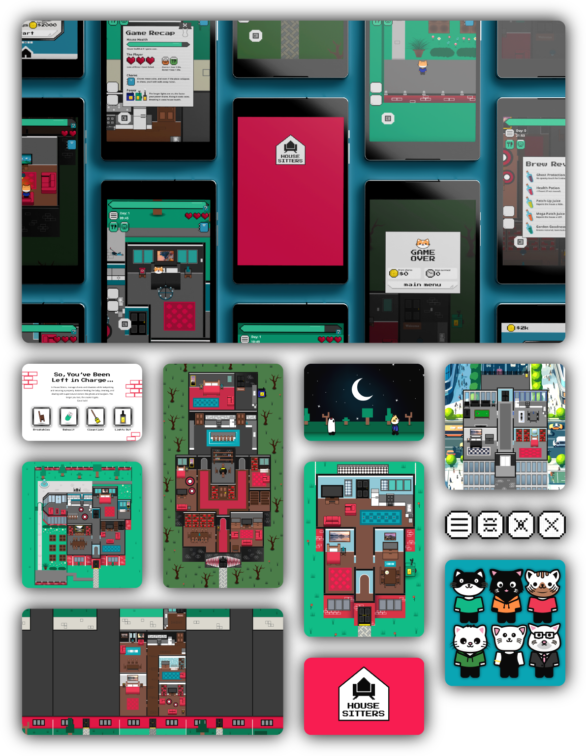
HOUSE SITTERS™ Personal Project
The Problem
Many casual games lack meaningful progression, ultimately making players quickly lose motivation and engagement.
The Insight
Combining task management with unexpected challenges can create rewarding, long-term gameplay for users.
The Solution
Players earn money through various chores, survive challenges, and gradually build their own home in-game.
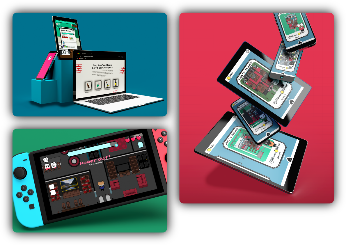
Platform & Website Mockups
HOUSE SITTERS™ will be playable on mobile devices and Nintendo Switch. The design highlights level menus, interface elements, and interactive features, while the website promotes the game’s launch, demonstrating a polished, cohesive experience across both platforms.
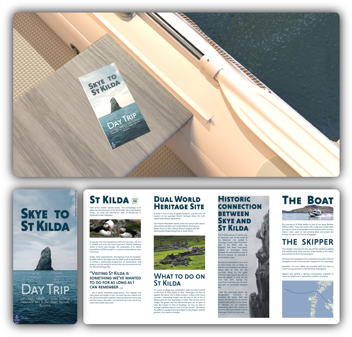
St Kilda Travel Brochure
The Problem
Presenting St Kilda’s history and wildlife clearly within a university travel brochure risked losing audience engagement.
The Insight
Using provided research showed layout, imagery, and hierarchy could communicate atmosphere without changing supplied content.
The Solution
I designed a structured brochure layout that visually expresses St Kilda’s character while meeting the brief.
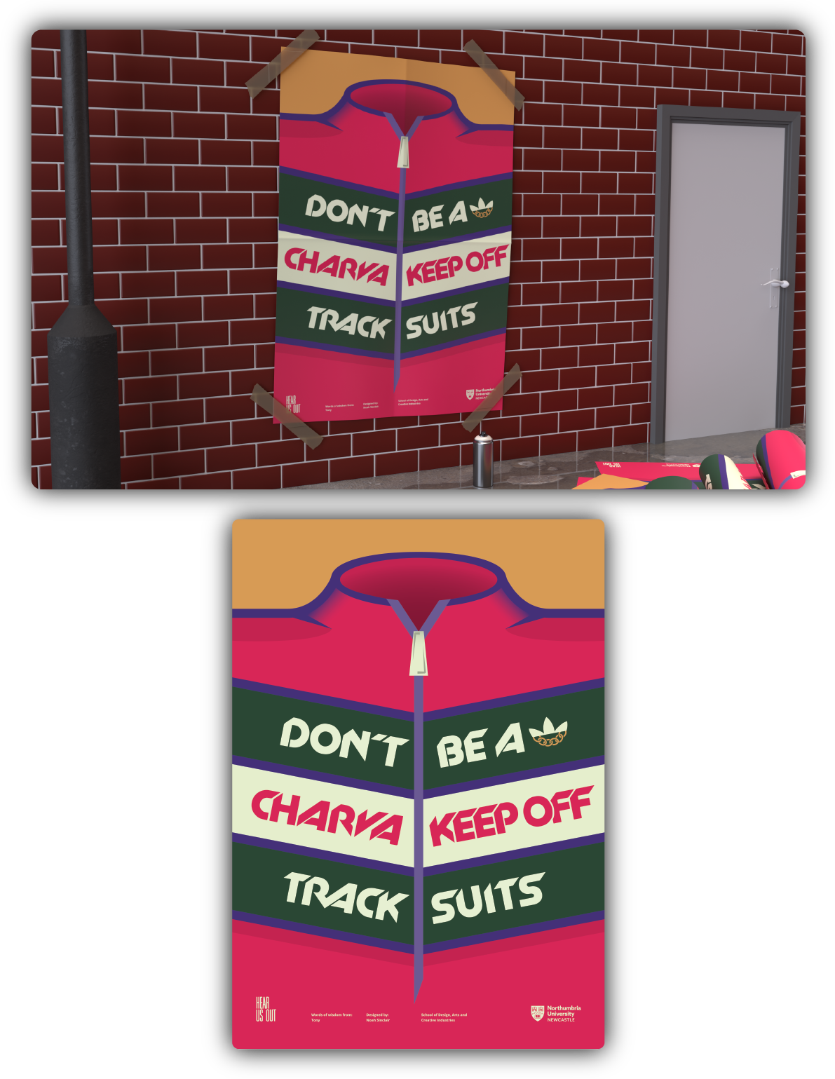
Hear Us Out Poster
The Problem
Creating a poster featuring older people’s quotes risked coming across overly serious or predictable for viewers.
The Insight
Tony’s quote was amusing yet relatable, showing how humour can make a poster more engaging.
The Solution
I designed a poster letting Tony’s words take centre stage with playful, thoughtful, and visually striking typography.
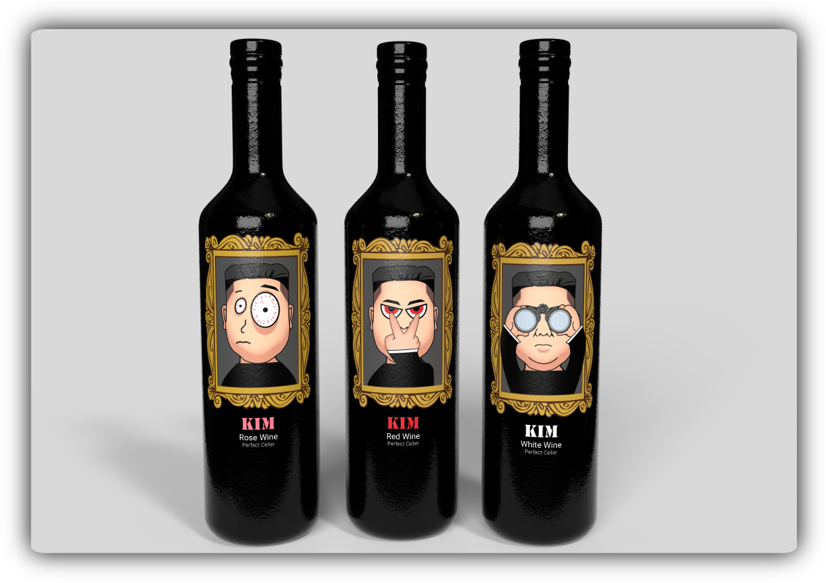
North Korean Wine Concept
The Problem
Creating a wine brand that feels unusual risked confusing potential consumers or not standing out on shelves.
The Insight
Choosing North Korea allowed playful, bold visuals, showing how unexpected associations attract attention effectively.
The Solution
I designed branding with striking graphics and tongue-in-cheek elements, making this wine memorable and shelf-ready.
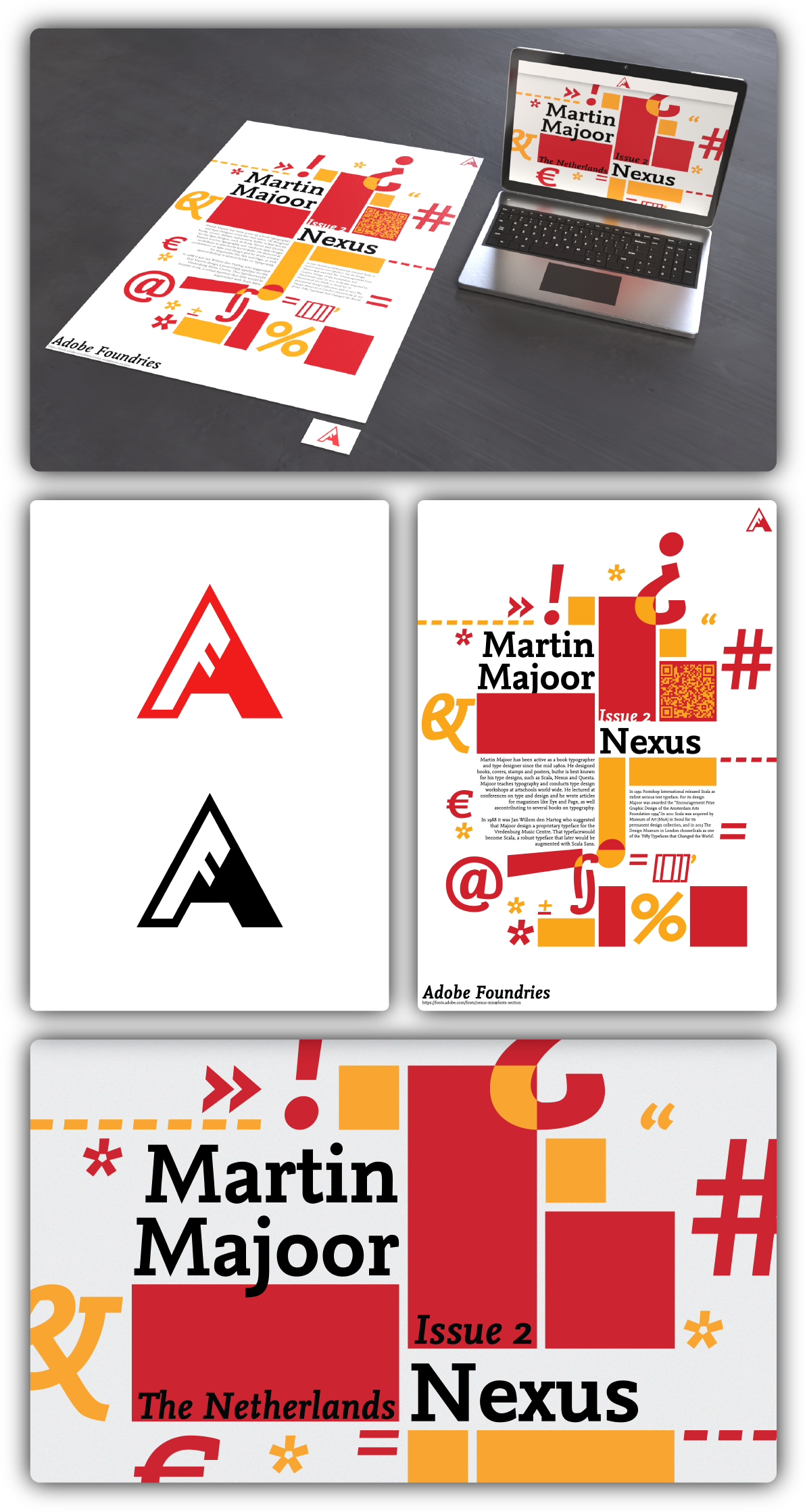
Adobe Foundries Campaign
The Problem
The brief required celebrating the Nexus Martin Majoor typeface through cohesive materials within limited time.
The Insight
Focusing on bold typography and clean layouts would let the typeface shine across all campaign pieces.
The Solution
I designed a poster, logo, and website landing page to build excitement and interest around the typeface.
Outdoor Spaces Poster
The Problem
Outdoor spaces’ impact on mental health is often overlooked, limiting public awareness and conversation.
The Insight
Combining personal experiences with research revealed how illustration could communicate wellbeing in natural environments effectively.
The Solution
I designed a poster using my signature grid style, submitting it to actively spark broader meaningful conversations.
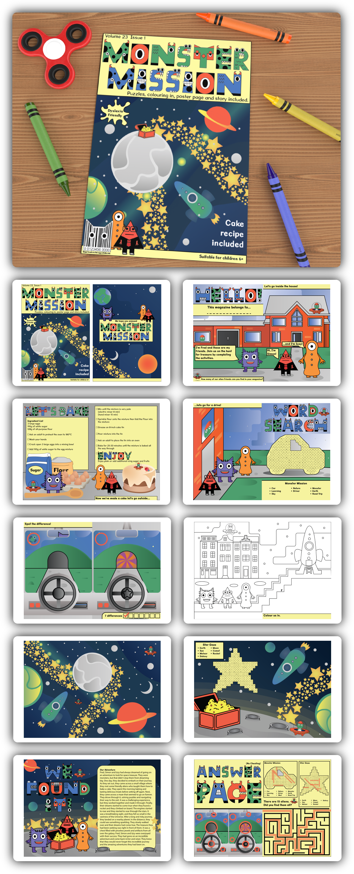
Dyslexia-Friendly Children’s Magazine
The Problem
Creating a magazine for children 6+ needed to consider dyslexia, making reading enjoyable and accessible.
The Insight
Using dyslexia-friendly fonts and yellow-tinted backgrounds could improve readability while maintaining playful, engaging energy.
The Solution
I designed an accessible, playful children’s magazine that supports reading ease and retains fun, vibrant appeal.
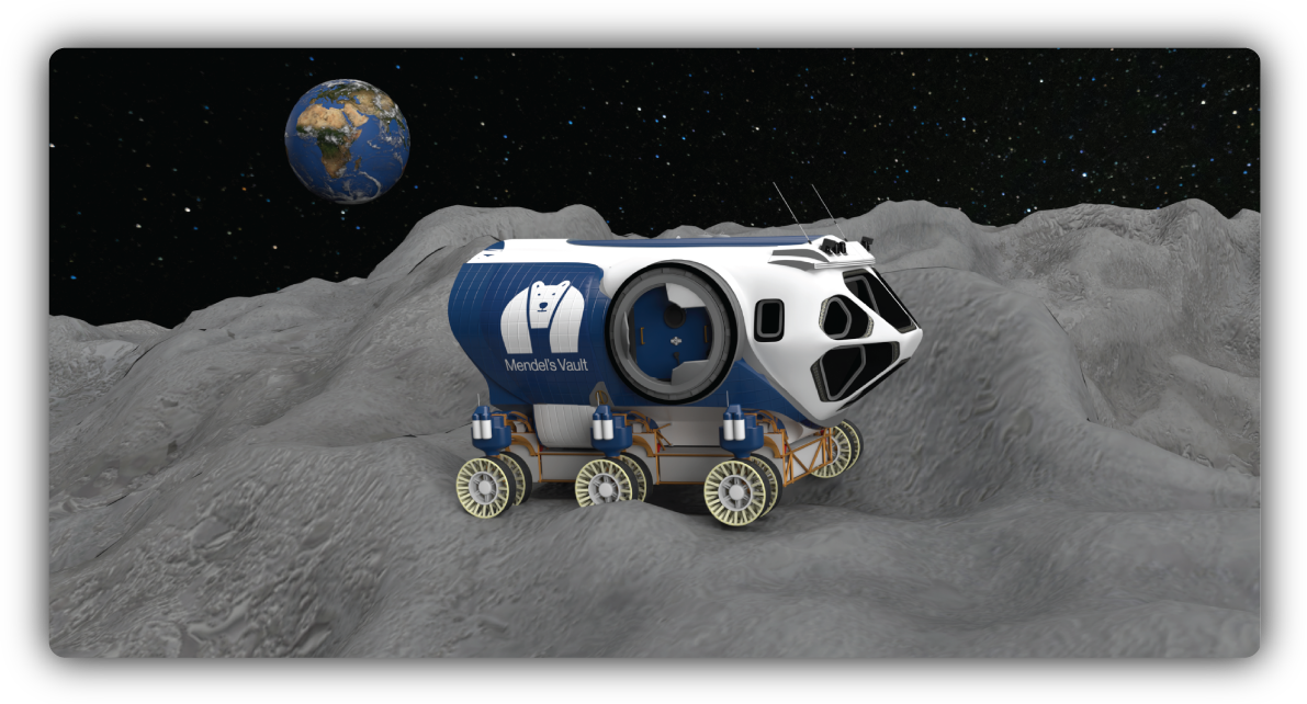
Mendel’s Vault Branding
The Problem
Designing a brand for a futuristic seed depository required conveying innovation, care, and planetary importance.
The Insight
The polar bear symbolised resilience and second chances, giving emotional weight to an otherwise technical project.
The Solution
I designed branding and an AR booklet imagining 2080, creating a visually striking, immersive experience.
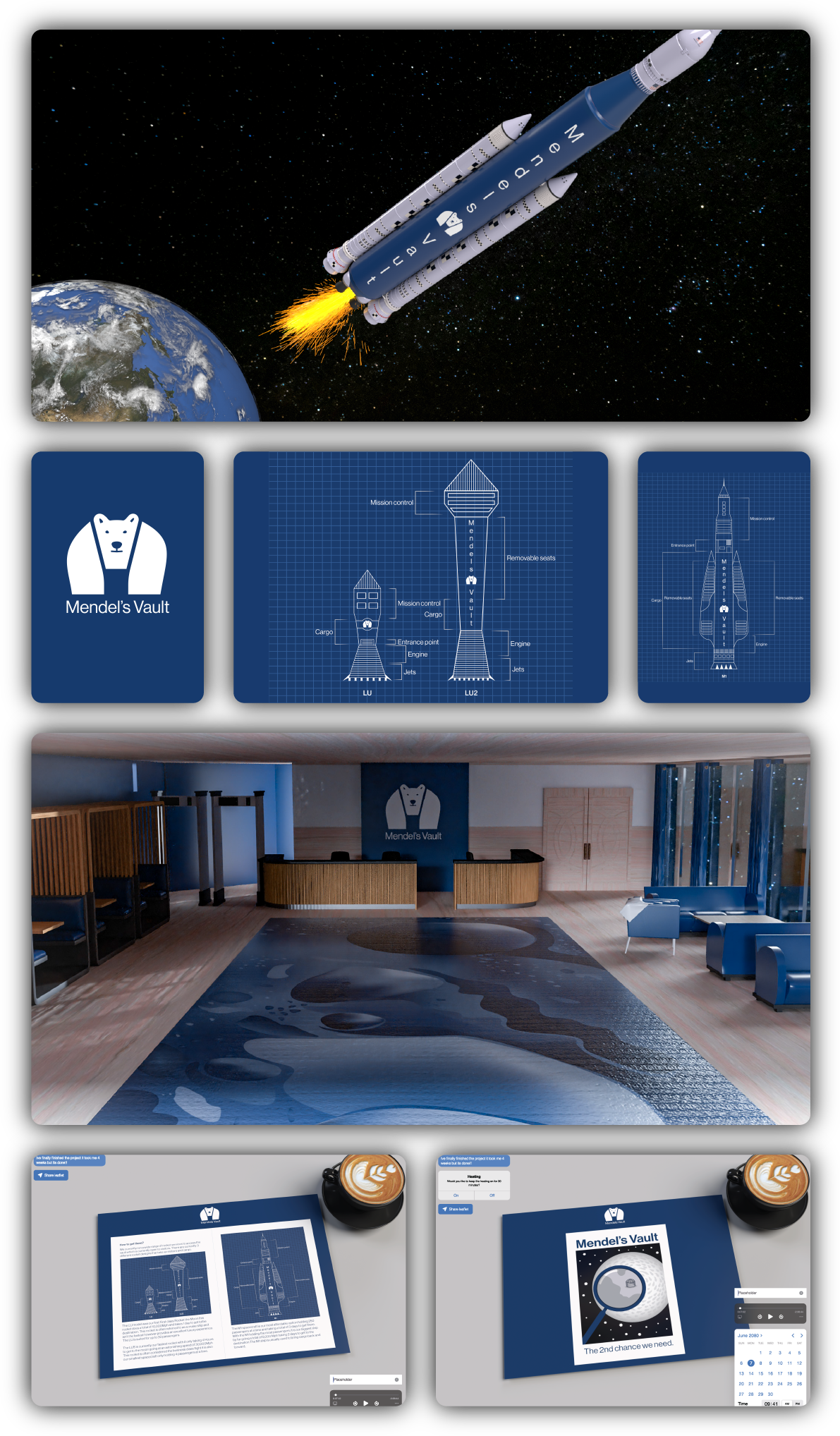
Virtual Exploration
The AR booklet lets users explore Mendel’s Vault in augmented reality, visualising futuristic seed storage, interacting with immersive 3D elements, and experiencing how humanity safeguards Earth’s biodiversity creatively.